If you run a growing business, you probably have more numbers than you want to deal with. Sales are in one file. Expenses sit in another. Payroll is somewhere else. Marketing reports live inside a platform you rarely open. Then, when it is time to make a decision, everyone scrambles to assemble a report.
That is usually when the question what is a KPI dashboard becomes practical rather than theoretical.
This reporting view gives you one clear place to see the numbers that matter most. It does not replace judgment. It helps you use that judgment sooner because you are no longer piecing together a story from scattered files, screenshots, and last week’s exports.
At VeridaTech, we see dashboards as decision support, not decoration. A business owner, founder, or manager should be able to open one and answer a few basic questions: Are we on track? What changed? What needs attention? What can wait?
For small and mid sized businesses in the Philippines, Australia, the United States, and the United Kingdom, that clarity can make reporting less stressful and planning more grounded.
What is a KPI Dashboard, in Plain English?
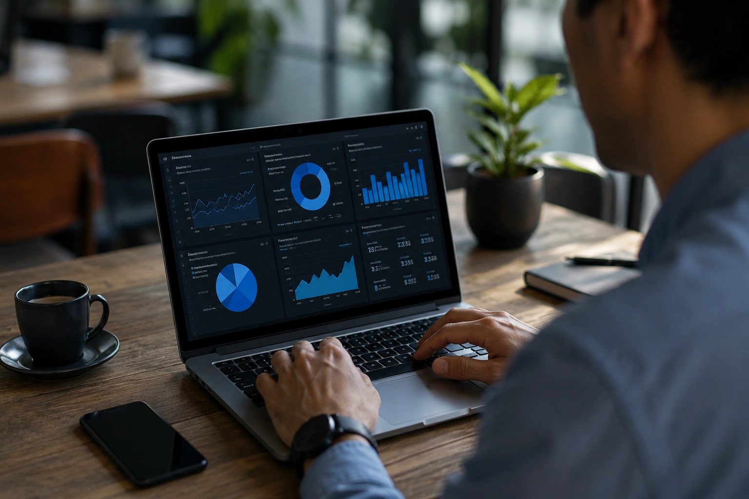
The dashboard is a visual reporting page that gathers the most important measures of business performance in one place. It uses scorecards, tables, charts, and status signals to show whether the business is moving toward its goals.
The short answer to what is a KPI dashboard is simple. It is a business dashboard focused on KPIs, the measures you rely on to judge progress.
KPI stands for key performance indicator. The word “key” matters. A company can track hundreds of numbers, but only a small group should guide regular decisions. Website visits may be useful, for example, while cash on hand may be critical. Headcount may deserve attention, but staff cost as a percentage of revenue could be the more revealing metric.
The KPI dashboard meaning is easy to miss when the screen looks impressive but answers no real business question. A proper key performance indicator dashboard connects every important number to a target, timeframe, owner, and decision.
Monthly sales alone is a metric. Monthly sales compared with a target is more useful. Add gross margin and a breakdown by product line, and the same number becomes far more actionable.
That is the difference between a polished report and a reporting view that helps you run the business.
How Does the Dashboard Work?
It works by gathering business data, calculating selected measures, and presenting the results in a readable visual format. Updates may be manual, scheduled, or real-time, depending on the systems and decisions involved.
Behind the screen, the process is fairly straightforward:
- Information enters from a data source such as accounting software, spreadsheets, a CRM, an inventory file, time logs, or customer records.
- The records are cleaned so names, dates, currencies, categories, and formulas line up.
- Calculations produce KPIs such as profit margin, sales growth, debtor days, utilisation rate, or conversion rate.
- The data visualization turns those results into scorecards, filters, tables, and a useful graph.
- The team reviews the figures on a set schedule and decides what needs a response.
The dashboard provides the final reporting layer. The real work sits underneath it: deciding what each metric means, checking the data, and making sure the calculation matches the way the business operates.
Excel, Google Sheets, Power BI, Looker Studio, Tableau, or another dashboard tool can handle the display. Power BI is often useful when several sources need to connect, while an Excel file may be entirely suitable for a smaller reporting process. Technology matters, but clear thinking matters more.
We have seen simple spreadsheet dashboards work well when the questions and source files are clear. We have also seen expensive systems disappoint because nobody agreed on the definitions. A real-time number is still unhelpful if it is calculated incorrectly.
What Should the Dashboard Show?
It should show the few measures that explain current results, targets, and performance over time. It should not display every available number because too much information can hide the signal.
This is where many dashboards go wrong. They become a wall of charts, so the stakeholder reading them cannot tell what deserves attention.
A useful dashboard normally includes:
- Current results, such as this month’s revenue, cash balance, open orders, or active clients
- Targets that show whether each result is ahead, behind, or close to plan
- Comparisons with the prior month, budget, forecast, or historical data
- Breakdowns by location, service line, product, project, channel, or customer type
- Warning signals for overdue invoices, rising costs, falling margins, or missed service levels
- Enough context to identify trends without burying the main point
In our experience, the best view feels calm. You can open it and grasp the main message within a minute. The visualization should guide your eye toward the issue, not make you work through a puzzle.
Microsoft describes KPI visuals as cues that communicate progress toward a measurable goal. That is a useful distinction. A number becomes more meaningful when you can compare it with something specific.
What Is the Difference Between a KPI, a Metric, and a Dashboard?
A metric is any measured number. A KPI is a metric important enough to guide a decision, while a dashboard is the screen where selected KPIs and supporting measures appear together.
That difference sounds minor until you begin creating the view.
Suppose you run a service company. You might record inquiries, booked calls, proposals sent, proposal win rate, project value, hours worked, and unpaid invoices. Each one is a metric. Your main KPIs, however, may be monthly revenue, gross margin, win rate, and cash collected.
Why those four? Together, they indicate whether the company is attracting work, pricing it sensibly, winning enough of it, and collecting cash on time.
When someone asks what is a KPI dashboard, they are often wrestling with this exact issue: which numbers deserve space on the main screen?
There is also a difference between a dashboard and a KPI report. A report often presents results for a fixed period and may include written explanation. A dashboard is usually designed for repeated viewing and quick comparison. An analytical dashboard goes further by letting a user filter, explore, and examine why a result changed.
The right choice depends on the business. A clinic, construction company, ecommerce shop, consulting agency, and logistics provider should not share the same set of KPIs. Their finance measures may overlap, but their operating questions will differ.
What Are the Main Types of KPI Dashboards?
These categories include strategic, executive, operational, tactical, analytical, and function specific views. Each type of dashboard serves a different audience and review schedule.
Strategic dashboards connect high level results with strategic goals. An executive dashboard may show revenue, margin, cash, customer retention, and a few operating signals for the leadership team. An executive KPI dashboard should stay concise enough to support a monthly or quarterly review.
Operational dashboards focus on current activity. They might show open orders, delivery delays, staffing, production output, or support tickets. Because the decisions happen quickly, some operational dashboards refresh daily or in real-time.
A tactical dashboard sits between those views. A department head may use it weekly to manage campaigns, sales pipelines, workloads, or budgets. An analytical dashboard is built for investigation, with filters and detailed comparisons that help explain why a number moved.
Modern KPI dashboards can combine these views, but combining them does not mean placing everything on one screen. The purpose of the dashboard should determine what appears first and what stays in a supporting page.
Why Do Businesses Use KPI Dashboards?
Businesses use them to reduce reporting confusion, see changes sooner, and make informed decisions with less guesswork. A shared view also gives teams a consistent way to discuss performance.
Business information often lives in too many places. One person has the sales file. Another owns the expense tracker. The bookkeeper has the latest profit and loss statement. Marketing has campaign figures, while operations tracks delivery status elsewhere.
What is a KPI dashboard? It allows selected figures to be reviewed together. KPI dashboards give owners a quicker way to see connections that separate files can hide. Used well, the dashboard helps a team make data-driven decisions without pretending that numbers remove human judgment.
McKinsey reported that intensive users of customer analytics were 23 times more likely to outperform competitors in acquiring new customers, nine times more likely to lead in customer loyalty, and almost 19 times more likely to achieve above average profitability. That finding does not mean a dashboard creates those results by itself. It does suggest that companies able to use information well can recognise and respond to change sooner.
There is a simpler benefit too: fewer repetitive reports. If your team spends hours each week copying figures into slides or answering requests for the latest version, a shared view can reduce that effort. The dashboard might also expose a reporting gap that has been quietly slowing decisions for months.
These practical gains sit at the centre of the benefits of KPI dashboards. They support performance tracking, create accountability, and connect everyday work with business goals.
What Is A Kpi Dashboard And What Makes It Useful?
Finance, sales, marketing, operations, and customer service are common examples. The right view depends on who will use it and what action that person can take.
A finance dashboard may cover revenue, gross margin, cash balance, accounts receivable, accounts payable, debtor days, expenses, and budget variance. These KPIs help an owner understand profitability and cash timing without reading a full set of accounts every day.
A sales view may show qualified leads, proposals, win rate, pipeline value, average deal size, and sales cycle length. The sales team can use those figures to see where opportunities are slowing and whether expected revenue is realistic.
A marketing KPI dashboard may combine qualified leads, cost per lead, conversion rate, website inquiries, campaign spend, and attributed revenue. Unlike broad marketing dashboards filled with activity counts, it should connect marketing performance with commercial results. A marketing manager may need channel detail, while the wider marketing team may need campaign and content results.
Operations could track completion time, capacity, stock movement, delivery delays, rework, or service tickets. Customer service could track response time, resolution time, satisfaction, complaints, repeat purchases, and retention.
Notice that these KPIs do not all belong in the same place. A founder may want 8 to 12 high level figures. A department lead needs more detail. The audience decides the view.
How Many KPIs Should a Dashboard Have?
Most small business dashboards work best with 5 to 12 main KPIs. Supporting pages can contain more detail, but the first screen should remain readable.
There is no universal number. Still, a screen with 30 main KPIs usually indicates that the business has not yet chosen what matters most.
We prefer to ask five questions before deciding:
- What decision will this view support?
- Who will use it?
- How often will that person review it?
- Which result would cause someone to act?
- What context is needed before taking that action?
Context matters. A weak sales month may be expected if campaigns were paused because capacity was full. Rising payroll may be fine if revenue and margin are increasing faster. Good KPI tracking shows the relationship rather than leaving a number on its own.
The summary should stay simple, but details can remain available through filters, notes, or supporting pages. That balance keeps the dashboard useful for quick reviews and deeper questions.
What Data Sources Can Feed a Dashboard?
It can use spreadsheets, accounting software, CRMs, ecommerce platforms, project tools, payroll files, databases, or manual entries. The best source is the one that records the required information accurately and consistently.
For many small and mid sized businesses, Excel or Google Sheets is still the starting point. That is perfectly reasonable when the files are structured and controlled. Spreadsheets are familiar, flexible, and cost effective.
Problems arise when formulas are copied without checking, tabs multiply, or several people maintain conflicting versions. Research by Raymond R. Panko found errors in 51 percent of spreadsheets across laboratory experiments, even though many were small models. His research also reported cell error rates of at least 1 to 2 percent across whole spreadsheets.
This is why data analysis and cleaning must come before design. If a source file is messy, the output will repeat the problem in a prettier format.
As a team grows, it may connect finance, sales, and operations systems to one controlled reporting model. Even then, someone must define the fields, test the calculations, and confirm that each result reflects reality. The more important the decision, the more carefully the source should be checked.
What Makes a Dashboard Effective?
An effective dashboard is clear, trusted, focused, and connected to real decisions. Attractive styling cannot rescue confusing definitions, stale information, or unreliable calculations.
Good dashboard design is less about adding colour and more about guiding attention. The most important result should be easy to find, and every chart should earn its space.
These best practices keep the view useful:
- Define every KPI, including its formula, timeframe, owner, and target.
- Confirm the source behind each metric and test totals against a trusted record.
- Use charts and graphs only when they communicate the result more clearly than a table or scorecard.
- Keep colours consistent. Reserve strong warning colours for results that genuinely need attention.
- Give each stakeholder the detail needed for a decision, without crowding the first screen.
- Review the dashboard on a weekly, monthly, or quarterly rhythm that matches the work.
A dashboard that nobody opens is simply a report with better styling. The review habit is what turns it into a management tool.
We prefer dashboards that improve conversations. Instead of spending half a meeting debating whose number is correct, the group can discuss what changed, why it changed, and what to do next.
How Do You Create a KPI Dashboard Step by Step?
Begin with the decisions the reporting view must support. Then select the measures, prepare the information, design the layout, test the results, and set a review schedule.
Here is the order we recommend when you build a KPI dashboard:
- Clarify the purpose. Decide whether you are monitoring finance, sales, marketing, operations, service quality, or overall company health.
- Choose the audience. A founder, finance manager, sales lead, and operations supervisor need different views.
- Select the KPIs. Choose only the measures that explain progress toward the relevant goals.
- Define the details. Record the formula, owner, source, timeframe, target, and refresh schedule for every KPI.
- Prepare the information. Correct inconsistent names, dates, categories, duplicates, missing entries, and formulas.
- Sketch the layout. Designing a dashboard on paper first can reveal clutter before any software work begins.
- Build the first version. Keep your first KPI dashboard simple enough to use without a training session.
- Test every result. Compare totals with trusted finance, sales, and operations records.
- Review it with users. Remove what they ignore and clarify what they question.
- Agree on ownership. Decide who updates it, who reviews it, and what happens when a result moves outside its target.
A KPI dashboard template can help you sketch possible layouts. Treat that example as a starting point, since it cannot know your chart of accounts, sales cycle, staffing model, costs, or cash timing.
If you want to start building a dashboard, resist the urge to choose the chart style first. Ask what decision the owner is trying to make. “Are we making money?” points toward finance. “Why are sales slowing?” calls for sales and marketing detail. “Are projects finishing on time?” needs an operations view.
That question also clarifies the KPI dashboard uses that matter to your company. With clean definitions and careful testing, you can create an effective KPI dashboard that people will actually trust.
When Should You Use Dashboard Software?
Consider dedicated software when manual reporting takes too long, information comes from several systems, or many people need the same updated view. A spreadsheet can still remain part of the process.
Not every company needs a complex platform immediately. A clean Excel dashboard may be the best KPI dashboard for a small team tracking monthly finance KPIs, sales activity, and operating trends.
There are signs, however, that dedicated reporting software could help:
- The team spends hours updating the same report
- Departments maintain different versions of the truth
- Users need filters by location, service, product, or customer group
- Leaders want a current view without asking someone to prepare it
- Manual charts have become difficult to maintain
- The company is preparing for investors, lenders, audits, or formal management reporting
The right KPI dashboard software should suit the team’s skills, budget, security needs, source systems, and reporting frequency. Buying the largest platform rarely fixes unclear definitions or poor source records.
Wavestone’s 2024 Data and AI Leadership Executive Survey reported that 87.9 percent of participants considered investment in data and analytics a top organisational priority. The survey focused on senior leaders in Fortune 1000 and global organisations, so their circumstances differ from those of most small businesses. The broader direction is still useful: companies want information they can use with less delay.
Start with the decision, clean the inputs, and choose the software last.
What Mistakes Make a Dashboard Less Useful?
Common mistakes include tracking too many figures, using unclear formulas, skipping cleanup, copying a generic template, and creating a view that nobody reviews. Most failures begin before the first visual is made.
The most familiar problem is the “everything dashboard.” It places sales, expenses, payroll, web traffic, customer service, operations, and monthly notes on one screen. It feels complete but asks the reader to work too hard.
Unclear ownership causes another problem. If revenue appears wrong, who checks it? If margin falls, who explains it? If receivables rise, who follows up? Accountability should become clearer, not blurrier.
There is also the temptation to copy a popular example exactly. Inspiration is useful, but another company’s layout cannot account for your sales cycle, service model, cost structure, or cash timing.
Finally, decide how to share a dashboard safely. People should see the information they need, but payroll, customer, and finance records may require access controls. Convenience should not override privacy.
Frequently Asked Questions About Dashboards
What Is the Simple KPI Dashboard Meaning?
It is a visual page that shows the most important measures of company performance in one place. It helps owners and managers compare results with targets and recognise issues sooner.
Is This the Same as a Business Dashboard?
It is one kind of business dashboard, but it has a narrower purpose. A general dashboard can display many useful measures, while this view concentrates on the figures tied most closely to goals and decisions.
What Is a Key Performance Indicator Dashboard Used For?
It is used to track KPIs connected with revenue, cash, profit, sales activity, marketing, customer service, operations, or team performance. The specific measures depend on the decisions the audience owns.
How Often Should It Be Updated?
Update frequency should match the decision. Sales and operational views may refresh daily or weekly, while finance reporting often works on a weekly or monthly cycle.
Can You Build One in Excel?
Yes. Many small businesses can begin in Excel if their information is clean, formulas are tested, and version control is managed. A connected reporting platform becomes more useful when several systems or frequent updates are involved.
What Should the First Dashboard Include?
A practical first view may include revenue, gross margin, cash balance, unpaid invoices, expenses, and sales pipeline. Those KPIs provide a grounded picture of sales, profit, and cash.
Why Do KPI Dashboards Fail?
They fail when definitions are unclear, inputs are unreliable, too many measures compete for attention, or nobody owns the review process. Good software cannot correct a weak reporting habit by itself.
What Should a Dashboard Help You Decide?
It should help you decide where attention, money, or follow-up is needed. If the screen cannot support a clear action, its contents need to be reconsidered.
Let Us Make Your Numbers Easier to Use
If what is a KPI dashboard is the question that brought you here, the next one is more useful: what should your dashboard help you decide?
That is where we can help.
At VeridaTech, we work with businesses that need clearer reporting without turning it into a technical headache. We can organise spreadsheets, clean records, build finance and operational views, prepare monthly reports, and create reporting systems your team can maintain.
We work onsite in the Philippines and online with clients in Australia, the United States, and the United Kingdom. Whether you need a focused Excel file or a connected reporting setup, we begin with the business question.
Your numbers are already telling a story. We will help make it easier to read.