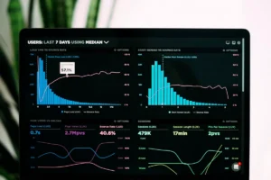

Business owners often ask about dashboard vs report because both can contain charts, totals, trends, and performance figures. The easiest way to separate them is by looking at what the information needs to accomplish.
A dashboard gives you a focused view of the numbers that need regular attention. A report provides the deeper detail needed to understand results, investigate changes, and document what happened.
In practice, the boundary can blur. An Excel workbook with a few charts may be called a dashboard. A Power BI file can contain several report pages. A monthly management report may even start with a one-page dashboard.
We start with the business decision rather than the software. Does an owner need to check cash and sales every morning? Does the finance team need month-end detail? Does a manager need to investigate why conversion dropped?
Once that question is clear, choosing the right format becomes much easier.
If you’re still defining the role of the dashboard itself, our guide to what a KPI dashboard is and how it works covers the fundamentals in more detail.
Dashboard vs Report, What Is the Main Difference?
A dashboard provides a concise view of selected measures for repeated monitoring. A report provides greater detail, explanation, supporting figures, and a record that can be reviewed later.
The practical distinction looks like this:
| Question | Dashboard | Report |
| Main Purpose | Monitor performance | Explain and document performance |
| Level of Detail | Selected KPIs and trends | Detailed figures, tables, and commentary |
| Typical Use | Frequent checks | Scheduled or detailed reviews |
| Common Format | One screen or overview page | Multi-page file, spreadsheet, PDF, or interactive report |
| User Action | Identify where attention is needed | Investigate causes and decide what to do |
| Typical Audience | Owners, managers, operational teams | Management, finance teams, clients, boards, or reviewers |
In Power BI specifically, Microsoft’s guidance on dashboards and reports distinguishes dashboards as single-page views, while reports can contain one or multiple pages with deeper filtering and exploration options.
Outside a particular software platform, the terminology is less important than the purpose.
A useful business dashboard should help answer, “Does anything need attention right now?”
A useful report should help answer, “What happened, why did it happen, and what do we need to do next?”
What Is a Business Dashboard?
A business dashboard is a focused view of measures that matter to a particular role, process, or decision.
It might display:
- Cash available
- Revenue against target
- Gross profit
- Overdue invoices
- Qualified leads
- Sales conversion rate
- Current project status
- Work due this week
- Capacity concerns
The exact measures depend on the business.
A professional services firm may focus on billable utilisation, project margins, receivables, and pipeline value. A retailer may need stock movement, sales by product, gross margin, and return rates. A subscription business may concentrate on recurring revenue, retention, cancellations, and collections.
Business dashboards similarly describes dashboards as a way to place related visual information and important business metrics together so users can understand them quickly.
More charts don’t automatically create a better dashboard. The measures should connect to real decisions.
Our Data & Analytics services include KPI formulation, dashboard creation, performance monitoring, forecasting, Power BI and Looker Studio reporting, and data validation for businesses that need a clearer reporting structure.
What Is a Business Report?
A business report provides a more detailed view of a topic, result, period, or problem.
Reports may include:
- Detailed financial statements
- Budget comparisons
- Variance analysis
- Transaction schedules
- Sales performance
- Accounts receivable aging
- Project results
- Cash flow forecasts
- Written commentary
- Recommended actions
For example, an owner may see on a dashboard that monthly profit has fallen below target. The monthly report can then show which costs increased, which product or service lines changed, how revenue compared with budget, and whether the result was caused by a recurring issue or a one-off expense.
That ability to move from a headline number into supporting information is one of the biggest differences between the two formats.
A report can still contain charts and interactive elements. Its defining feature is the depth of information it provides.
How Do Dashboards and Reports Work Together?
The dashboard vs report decision doesn’t always require choosing one and abandoning the other. They often work as two layers of the same reporting process.
Consider sales.
A sales manager might check a dashboard each morning for:
- Revenue
- New orders
- Qualified opportunities
- Conversion rate
- Late follow-ups
If conversion drops, the dashboard identifies the problem.
A more detailed sales report can then break performance down by product, campaign, channel, salesperson, customer segment, or period.
The same approach works in finance.
An owner might monitor cash, receivables, expenses, and expected payments through a dashboard. At month-end, a finance report can explain profitability, cash movements, major costs, outstanding accounts, and upcoming commitments.
The dashboard supports regular monitoring. The report provides the detail required for investigation, review, and planning.
When Should You Use a Dashboard?
Choose a dashboard when a small group of important measures needs frequent attention.
A dashboard works particularly well when:
- You want a regular business health check.
- Managers have limited time to review information.
- The same KPIs are monitored repeatedly.
- Source data is updated often enough to remain useful.
- A change in performance may require a quick response.
- Users understand what action follows when a measure moves outside its target.
That final point matters.
A red indicator isn’t particularly useful when nobody knows what it means or who should respond. Each important KPI should have a clear definition, target, responsible person, and next action.
For teams building their first reporting process, our guide on how to build a KPI dashboard for better reporting covers KPI selection, source data, layout, testing, and ongoing maintenance.
When Should You Use a Report?
Use a report when the reader needs more than a quick signal.
A report is usually appropriate when you need to:
- Explain why revenue, cash, profit, or costs changed
- Review detailed transactions
- Compare actual performance with a budget or forecast
- Analyse performance by customer, project, product, or period
- Document assumptions and findings
- Prepare information for a management meeting
- Share results with clients or other stakeholders
- Maintain a dated record of results and decisions
Reports are also useful when readers need written context.
A chart may show that expenses increased by 15 percent. A report can explain whether that increase came from equipment purchases, overtime, supplier pricing, expansion costs, or another identifiable cause.
The number shows what changed. The supporting analysis explains why it matters.
Can a Dashboard Replace a Report?
Sometimes.
A dashboard may replace a repetitive summary report when users only need current measures and simple comparisons.
Imagine a weekly PDF containing the same six charts every Friday. If reliable data is already available and nobody needs written analysis, a regularly refreshed dashboard may reduce unnecessary preparation work.
A detailed monthly management report is different.
The figures alone may not explain an unusual expense, delayed payment, pricing change, project overrun, or other significant event. Written context and supporting schedules may still be necessary.
For many growing businesses, the better approach is to decide what belongs on the monitoring screen and what supporting detail should sit behind it.
What Should a Good Dashboard Include?
A useful dashboard should have a clear purpose and enough context to make its numbers meaningful.
We generally recommend including:
- A clearly defined reporting period so users know how current the figures are.
- A limited set of KPIs connected to specific business decisions.
- Targets or comparisons such as budget, prior period, or expected range.
- Recent trends so users can distinguish a one-off movement from a developing pattern.
- Clear definitions for measures that could otherwise be interpreted differently.
- Supporting detail that users can reach when they need to investigate a result.
The source data matters just as much as the visual design.
Missing transactions, inconsistent categories, duplicated records, and broken formulas can make a polished dashboard unreliable.
For businesses already working mainly in spreadsheets, our Excel and spreadsheet services include Excel dashboards, pivot tables, charts, spreadsheet cleanup, financial models, reporting, and automation.
What Should a Good Report Include?
A strong report should make the main result clear before moving into the supporting detail.
A monthly finance report, for example, might begin with:
- Revenue
- Gross profit
- Net profit
- Cash position
- Accounts receivable
- Major budget variances
Supporting pages can then provide financial statements, schedules, commentary, explanations, and actions.
Consistency is essential.
If gross profit is calculated one way in January and another way in March, the trend becomes unreliable. The same applies to customer definitions, cost categories, reporting periods, and cutoff dates.
Financial reports also depend on current and organised source records. Our bookkeeping and finance support includes reconciliation, accounts receivable, expense tracking, cash flow monitoring, and financial report preparation that can feed into recurring management reporting.
How Do You Choose Between a Dashboard and a Report?
Start with the decision the reader needs to make.
Ask:
- What question should this information answer?
- Who will use it?
- How often will they review it?
- Do they need a quick signal or detailed explanation?
- Do users need transaction-level information?
- How often is the underlying data updated?
- Does the output need written commentary?
- Does it need to be printed, approved, shared, or retained?
- What action should follow when performance moves outside the expected range?
The difference between dashboard and report becomes much clearer when the business question is specific.
“We need better visibility” gives very little direction.
“We need to know every morning whether expected cash receipts will cover payments due during the next two weeks” provides enough detail to choose measures, sources, update frequency, and layout.
What Reporting Mistakes Should You Avoid?
One common mistake is starting with charts before deciding what the business needs to know.
Another is adding every available metric to one dashboard. Too much information can make important changes harder to notice.
Reports can have the opposite problem. They may become long collections of tables without enough explanation to help anyone make a decision.
Other common problems include:
- Inconsistent KPI definitions
- Outdated source data
- Broken spreadsheet formulas
- Duplicated records
- Different reporting periods across files
- Targets with no business context
- Alerts with no responsible owner
- Reports that arrive after the decision has already been made
Automation doesn’t remove the need for controls. Connected systems can still contain missing, duplicated, incorrectly mapped, or delayed information.
A reliable reporting process needs clear definitions, dependable source records, and someone responsible for reviewing the output.
Frequently Asked Questions
What Is the Difference Between a Dashboard and a Report?
A dashboard presents selected measures for quick and repeated monitoring. A report provides more detail, context, analysis, and documentation.
Is a Dashboard a Type of Report?
It can be in everyday business language. Software platforms use the terms differently, so it is useful to define what “dashboard” and “report” mean within your own reporting process.
Is a Dashboard Always Real-Time?
No. A dashboard may refresh in real time, daily, weekly, monthly, or whenever its source data is updated. Always make the reporting period or last refresh date visible.
Can a Report Have Charts?
Yes. Reports can include charts, tables, scorecards, commentary, and detailed schedules. The main difference is purpose and depth rather than whether visualisations are present.
Which Is Better for a Small Business?
Neither format is automatically better. A small business may use a concise dashboard for regular monitoring and detailed reports for monthly review, investigation, forecasting, and planning.
What Is a Reporting Dashboard?
A reporting dashboard is generally a visual summary of important measures drawn from one or more reporting sources. Define its intended audience, source data, update schedule, and purpose before building it.
Do You Need Both a Dashboard and a Report?
Many businesses benefit from both. The dashboard shows where attention may be required, while the report provides the supporting detail needed to understand the issue.
Build Reporting Your Team Will Actually Use
The right reporting format should make your numbers easier to understand and your next decision easier to make.
At VeridaTech, we help businesses organise scattered spreadsheets, financial records, sales data, and operational information into practical dashboards and reports.
We can help clean and validate the source data, define useful measures, create Excel, Power BI, or Looker Studio outputs, and put a repeatable reporting process around them.
Whether your team needs a simple business dashboard, a detailed monthly report, or both, the goal is the same: reliable information that people can understand, maintain, and use.
If you’re deciding between a dashboard vs report for your current reporting process, talk with our team about your reporting needs and we’ll help you choose a practical structure.